HiDoctor Gamified Ecosystem
From Crisis Management to a Continuous Growth Journey
HiDoctor is a digital health platform offering therapy sessions, clinical tests, and wellness services to both B2C users and corporate clients.
I transformed HiDoctor’s transactional service model into a transformational "Growth Journey" by designing an ethical, milestone-based gamification system. My goal was to bridge the clinical gap between sessions 1 and 3, guiding users toward the 4-session threshold where real behavioral change occurs. By using the Olive Tree metaphor, I replaced "guilt-driven" mechanics with "investment-driven" growth.
UX Design
Product Thinking
Gamification
AI assisted Design
The Challenge: The "Surgery" Fallacy
Despite offering comprehensive health services, data showed that users struggled to maintain long-term progress and often dropped off after a single interaction. I identified through data and expert interviews three primary psychological and business barriers:
Transactional Mindset: Users viewed therapy as a one-time "surgery" to fix an immediate crisis, rather than a cumulative, preventive process.
The Post-Session Void: Users lacked a clear reason to engage with the app between weekly sessions, leading to decreased motivation.
The 4-Session Threshold: Clinical outcomes require at least 4 sessions of continuity, a goal the previous UI failed to visualize or encourage effectively.
Discovery & Deep Dive Research: The "Why"
To validate the challenge, I conducted a multi-layered research process:
Quantitative Insight (HiDoctor Dashboard)
Data analysis confirmed a significant drop-off (churn) between sessions 1 and 3.

User Interviews
We used interviews to translate the problem into behavioral patterns (not demographics) and to synthesize two personas that represent distinct engagement risks.

UX takeaway: One-size-fits-all gamification fails in health. We needed a milestone system that supports both calm exploration and goal clarity—without competition or streak pressure.
Desk Research
Therapy drop-off is widely described as premature termination—ending therapy earlier than clinically recommended. Meta-analytic work shows dropout is common, but rates vary widely depending on how “dropout” is defined and the setting. link
Across studies and reviews, the most repeated drivers of early termination map cleanly to our product problem:
-
Therapeutic alliance risk: A weaker early alliance is consistently associated with higher dropout risk. link
-
Expectation mismatch: Many users expect noticeable relief immediately; if Session 1 doesn’t “fix it,” motivation drops (or they reframe it as “it’s not for me”). link
-
Practical friction: Time, cost, scheduling and emotional effort become heavier after the initial “crisis” energy fades—especially when the app does not provide supportive structure between sessions. link
Benchmarking
I analyzed direct and indirect competitors to identify how they handle long-term engagement.


From Discovery to Persona Synthesis
User interviews revealed two dominant engagement patterns:
-
Users who disengage when systems feel pressuring or judgmental
-
Users who disengage when progress feels vague or unstructured
This showed that one-size-fits-all gamification would fail in a health context.
To validate these patterns, I mapped behaviors using:
Bartle Player Types to understand whether users are driven more by exploration or achievement
Octalysis Core Drives to identify intrinsic vs. extrinsic motivation without relying on pressure-based mechanics

While personas define who we design for, empathy maps reveal how they experience the product.


Empathy maps became a filter for every design decision that followed.
Design Goals
Make progress visible
Users should instantly understand where they are in their journey.
Encourage continuity, not pressure
No streaks, no punishment (only positive reinforcement)
Support holistic health
Encourage users to explore multiple services, not just one.
Keep it simple and scalable
Easy to understand, easy to extend.
My Approach: AI-Assisted UX Design
Instead of following a traditional “wireframe first” process, I intentionally integrated AI into the thinking and structuring phase of the project.
Custom GPT as a Thinking Partner
I created a custom GPT specifically for HiDoctor product and UX decisions.
With this GPT, I:
-
Explored multiple gamification models
-
Evaluated pros and cons of task-based vs milestone-based systems
-
Stress-tested UX decisions from both user and business perspectives
-
Refined language, tone, and motivation mechanics
AI was not used to replace design thinking — it was used to challenge, structure, and accelerate it.

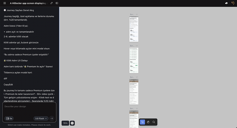
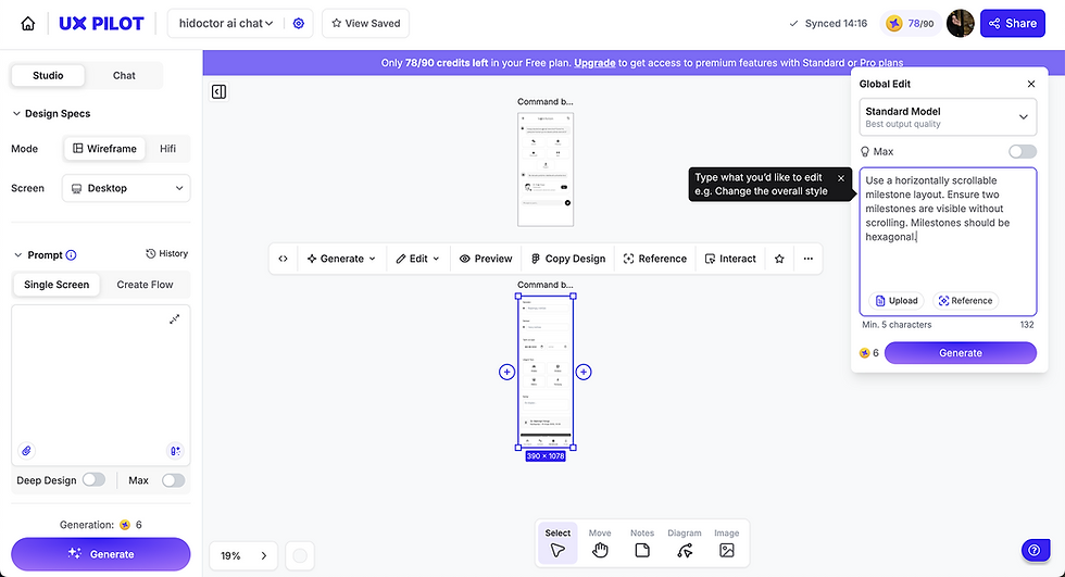
AI-Assisted Rapid Prototyping (Tool Comparison)
To validate the gamification experience quickly, I used AI tools as prototyping accelerators rather than design shortcuts.
I tested the same UX brief across Google Stitch, UX Pilot, Figma Make, and Figma Site to compare how well each translated the intended experience.
Instead of creating manual wireframes, I generated interactive, wireframe-level outputs and evaluated clarity, calmness, and scalability early.
Figma Make and Figma Site produced the closest results to the brief, allowing me to finalize the UX structure faster before moving into UI design.
Generated quick layout variations, but required more manual alignment with our “simple + calm” UX constraints.
Helpful for rapid structure, but the output needed more work to match our gamification logic and information hierarchy.

After comparing outputs, I continued iteration with the tools that stayed closest to the brief and minimized rework.
Generated quick layout variations, but required more manual alignment with our “simple + calm” UX constraints.

Behavioral Psychology: The Olive Tree Framework
I chose the Olive Tree metaphor to represent resilience and slow, sustainable growth.

Endowment Effect:
As users earn Growth Points by completing tasks, they "grow" their virtual tree. The more effort they invest, the higher the psychological cost of abandoning the platform.

Growth Points (Gelişim Puanı):
Points never reset and cannot be spent. They act as a permanent record of the user's "goodness" and investment in themselves.


Persona-Centric Design:
For Elif (The Calm Explorer), we avoided competition. Instead of leaderboards, we used Self-Determination Theory (SDT) to focus on autonomy and competence.
System Architecture: 4 Pillars
I categorized tasks to address specific business and user needs:

Onboarding (Activation): Quick wins like profile completion to build immediate momentum.

Service Habits (Retention): High-value tasks (e.g., "2 sessions/month" or "20 sessions in 6 months") to push users past the 4-session clinical threshold.


Daily Engagement (Stickiness): Filling the "Post-Session Void" with mood tracking and clinical tests.
Social Proof (Growth): Sharing milestones to build community without social pressure.
Key Screens
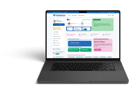
Desktop Home — Gamification Entry Point (Dashboard Card)
The homepage card makes the “Growth Journey” visible inside the dashboard. Users can see their current progress, next milestone target, and quick shortcuts to sessions, health focus, and badges—turning a service list into a guided journey.

Desktop — Milestone Level-Up Popup
When users reach a milestone, a celebratory popup explains what changed, why it matters, and what they earned (badge + voucher). It also previews the next stage, keeping momentum without urgency.

Badges — Locked State + “How to Earn” Tooltip
Locked badges stay visible (curiosity + direction), with a lightweight tooltip that explains how to unlock them. This avoids hidden goals while keeping cognitive load low.

Badges — Desktop Badge Gallery (All Categories)
Badges are grouped into understandable categories to help users build a mental model of progress: Journey badges (Seed → Legend) and behavior badges (sessions, habits, exploration, community). This keeps motivation structured and meaningful.

Mobile Home — Compact Progress Mini Bar
Mobile behavior is “quick check-ins,” so progress appears as a compact mini bar under the profile. It gives instant motivation without taking over the homepage, and users can expand for details only when needed.

Outcome & Impact
This system is designed to:
-
increase continuity beyond the first session by making progress visible
-
reduce drop-off between sessions 1–3 by filling the “post-session void”
-
drive repeat usage through calm, meaningful touchpoints
-
encourage holistic wellbeing discovery without clutter
-
support business value via sustainable rewards aligned with session economics
What I’d Improve Next
If I continued this project, I would:
-
A/B test milestone thresholds and reward types
-
iterate task copy for clarity + motivation
-
refine the mobile mini-bar placement and tap targets
-
explore personalization: “recommended next task” based on user behavior