HiDoctor: making therapy progress visible between sessions
Milestone-based gamification for a Turkish online therapy and wellbeing platform, built to keep clients going between sessions 1 and 3, where most dropped off.
Shipped in 2025, desktop and mobile.
Growth points80 / 120
Role
Lead Product Designer: UX strategy, IA, UI, prototyping
Client
HiDoctor, digital health, B2C and corporate
Timeline
About 14 weeks in 2025, sole designer working with stakeholders
Output
Behaviour system, desktop dashboard, mobile
In short
Problem
Clients treated therapy as an emergency fix and left after a session or two, before it usually starts to pay off.
What I designed
Tohumdan Ağaca (Seed to Tree): an eight-stage growth system of growth points, badges and rewards across therapy, tests and wellbeing content. No streaks, no leaderboards.
Where it stands
Live on desktop and mobile since 2025. I can't share post-launch numbers.
Problem
Clients were leaving before therapy could work
HiDoctor offers online therapy, nutrition, fitness and doctor consultations. Three things pushed therapy clients to leave early.
A one-off mindset. People used therapy like an emergency appointment, not a practice that builds over time, and left once the worst had passed.
Nothing between sessions. With weekly sessions, nothing brought people back in between, so momentum faded in the gap that mattered.
An invisible threshold. Clinical evidence suggests continuity starts to pay off around the fourth session. The old interface couldn't show it, let alone make it a goal.
Where it broke. Anonymised dashboard data: engagement collapsed between sessions 1 and 3, well before clinical benefit usually begins.
Research
Four sources, two kinds of drop-off
Dashboard data. Anonymised cohorts confirmed the churn and made its cost measurable.
User interviews. Read for behaviour patterns, they surfaced two different engagement risks.
Literature on early dropout. Research on premature termination names three drivers: a fragile early therapeutic alliance, disappointment when session one doesn't "fix it", and the cost in time, money and emotional effort.
Competitors. Most lean on streaks and leaderboards: fine for fitness, risky in mental health.
Benchmark. How direct and indirect competitors handle long-term engagement.
Two reasons people stop
The interviews split by what makes someone give up, not by age or job.
Elif, the calm explorer
Stops when she feels pressured
Curious about her wellbeing, but scoreboards, streaks and red badges feel like judgment. She needs autonomy, gentle structure and time.
Driver
Autonomy and competence (self-determination theory)
Player type
Explorer (Bartle)
Works
Calm copy, optional prompts, quiet wins
Pushes away
Streaks, leaderboards, urgent red
Mert, the goal seeker
Stops when progress feels vague
He keeps showing up if he can see his level, what the next milestone unlocks and how each task adds up.
Driver
Accomplishment and ownership (Octalysis)
Player type
Achiever (Bartle)
Works
Visible levels, clear thresholds, vouchers
Pushes away
Vague progress, endless catalogues
One motivation model would have lost one of them: Elif needed less pressure, Mert more clarity. Two frameworks showed where they overlap.
Bartle player types
Octalysis core drives
What it meant for the design
Both pull away from pressure and respond to intrinsic motivation: exploring, meaning, calm progress. So I built around milestones and growth and left out Octalysis drives 5 to 8: social comparison, scarcity, unpredictability and loss. Social stayed as support in the "doing it together" badges, never as a ranking.
Constraints
Four tests every decision had to pass
Readable at a glance
Users should see where they are without reading a word.
Continuity without pressure
No streaks, no penalties, no broken-flame icons. Positive reinforcement only.
The whole platform
Invite people into therapy, tests and wellbeing content, not one service.
Easy to extend
Easy for users to read and the team to grow: every new task fits one of four pillars.
The metaphor
Tohumdan Ağaca: from seed to tree
An olive tree takes decades to mature, can't be rushed and rewards steady care with fruit for generations. For a Turkish audience it means more than numbered levels, and it gave the eight stages real names.
Pick a stage or watch the tree grow.
Profile complete, focus area chosen, a first quiet step.
Two sessions done. Daily mood check-ins becoming a habit.
First milestone reward. The gap between sessions starts to fill.
Past the four-session threshold. Continuing is now normal.
Exploring more than one service. Some choose to share progress.
Healthy habits are routine. Rewards scale with session economics.
Steady practice across services. Nudges are rarely needed.
Ambassador tier. Rare, lasting, a quiet goal for everyone else.
The psychology underneath
Endowment effect. Each task grows the tree. The more someone puts in, the less they want to leave, and nothing is ever taken back.
Growth points (Gelişim Puanı). A permanent record of what users invest in themselves, drawn as a water droplet, what a tree needs. Never spent, never reset, no wallet, no ranking.
Self-determination theory. No leaderboards for Elif, an always-visible next milestone for Mert. The same eight stages carry both.
System
Four pillars, from activation to growth
Tasks are grouped by the business outcome they drive, roughly short-term to long-term.
Pillar
Goal
Example tasks
Onboarding
Activation
Complete your profile, pick a focus area, first mood check-in
Service habits
Retention
2 sessions a month, 20 sessions in 6 months, try a second therapist
Daily engagement
Stickiness
Mood tracking, short clinical tests, reflection prompts
Social proof
Growth
Share a milestone, refer a friend, optional community badges
The second pillar, service habits, matters most. It takes people past the four-session threshold, where therapy starts to compound.
In the product
Where the system meets the screen
Four surfaces do most of the work, in HiDoctor's blue and green, with droplets for growth points and scalloped badges for stages.
Home
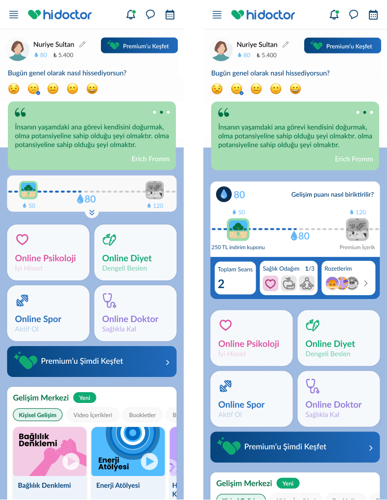
Desktop home. The progress strip comes first: where you are, how far the next milestone is, what it unlocks. Everything else stays where returning clients expect it.
The home on mobile
A quick check-in first. The day starts with a one-tap mood question, a small reason to open the app between sessions.
Progress in one line. Last milestone, next milestone and growth points as droplets. One tap expands it.
Services stay where they were. Psychology, nutrition, fitness and doctor tiles keep their colours, so habits aren't disrupted.
Content as the in-between task. The development centre fills the days without a session.
Scroll inside the screen to see the whole home.
Milestone
Milestone popup. One screen per finished stage: new badge, a short encouraging line, the reward and the next stage. One green button takes them back.
Locked badges stay visible. Tap one for a short tooltip on how to earn it.
Two shapes, two meanings. Scalloped badges mark stages. Hexagons cover three behaviour categories: new experiences, healthy habits and doing it together.
Process
Testing the structure with AI before wireframes
I set up a custom GPT with HiDoctor's product context as a sparring partner to compare gamification models, test task-based against milestone-based structure and check each decision from the user and business side. It pushed back on weak ideas faster than a notebook.
Then I gave the same brief to four prototyping tools to see which kept the experience calm, scalable and built around milestones. I was really testing the brief for unclear spots.
Tool
Fit with the brief
What I saw
Google Stitch
Quick layout variations, but keeping them calm and simple took a lot of manual work.
UX Pilot
Useful for early flows. The visuals drifted towards generic SaaS.
Figma Make
Closest to the brief in milestone language, tone and restraint. I used it to lock the IA.
Figma Sites
Best for stitching screens into a clickable story for stakeholder reviews.
Google Stitch, early flows
UX Pilot, structure test
The direction I chose
Outcome
What it was built for, and what's next
I can't share post-launch data, so these are aims, not results.
Designed to
Raise continuation past session 1 by showing progress at every entry point.
Reduce drop-off between sessions 1 and 3 with calm, optional touchpoints.
Bring people back with pressure-free milestone moments.
Surface tests and wellbeing content without crowding the home screen.
Tie rewards to session economics so they stay sustainable.
Next
A/B test milestone thresholds and reward types against the four-session benchmark.
Make task copy clearer, especially for days between sessions.
Refine the mobile progress card's position and tap targets.
Suggest a next task from each person's behaviour and stage.
Bring it to corporate accounts: same metaphor, different incentives.