Work / Tend
Tend: a wellness app that adjusts to the day you're having
A self-initiated concept for people who have tried wellness apps and dropped them. The home screen adapts to the time of day, the calendar and a quick check-in, so a hard Tuesday doesn't break a streak.
Concept. Not yet tested with users.


- Role
- Sole designer: research, interaction, UI, visual identity
- Type
- Self-initiated concept, iOS first
- Time
- 2 weeks, end to end
- Tools
- Figma, Figma Make, ChatGPT, Gemini
In short
- Problem
- Most wellness apps run on streaks. One bad day breaks it, and the guilt keeps people away.
- What I designed
- A home screen with morning and evening modes, a 30-second "Tune my day" flow that rewrites the day's targets, and a profile where missed days stay neutral.
- Where it stands
- A two-week concept. Next I'd test the voice input and compare the two-mode home with a static one.
Problem
Why people quit wellness apps
Retention in this space is hard.
Baumel, Muench, Edan & Kane, Objective User Engagement With Mental Health Apps, Journal of Medical Internet Research, 2019. Day 15 was 3.9%. Fitness apps aren't the same category, but the curve looks familiar.
I don't think the cause is low motivation. Most of these apps run on one loop: set a goal, hit it, keep the streak. Then comes a long meeting day, a sick kid, a week with no energy. One missed day breaks the streak, and the guilt becomes a reason to stay away.
So my question was: what would a wellness app look like if it were designed for the weeks people actually have?
Who it's for
Selin tried five wellness apps last year
Selin is 30, works in digital marketing in Istanbul and sits at a desk most of the day. On a good morning she wants an ambitious plan. At 9 PM, after back-to-back meetings, she wants permission to skip and rest. None of the apps she tried could tell those days apart.
Selin is a proto-persona: I drafted her with ChatGPT from desk research and visualised her in Figma Make. A real study would replace her with interview data. Early documents call the product VITA.
"Just tell me what to do today. Too many options make me quit."
Selin, from her persona card
What her empathy map says
- Says. "I usually quit after day three. I need reminders and encouragement."
- Thinks. "If I miss a day or two, does everything fall apart?"
- Feels. Hopeful at first, easily disappointed a few days in.
- Pain. An all-or-nothing mindset after missing tasks.
One line on her persona card complicated things: streaks and badges motivate her, until one breaks and the all-or-nothing reaction takes over. So Tend keeps visible progress and drops the part that punishes a gap.


Guilt runs through all of this. Every screen either adds to it or takes some away, and I made taking it away Tend's main job.
Principles
Four rules I set before drawing anything
Read the context first
Before suggesting anything, the app checks the time of day, energy level, how full the calendar is and the user's mood.
Make the step small
Every suggestion should be doable now: a 5-minute desk stretch, not a 30-minute workout. Motivation tends to follow action, so the job is to make starting cheap.
Keep missed days neutral
A missed day is a signal to recalibrate. No red, no streak counts, no empty charts. Coming back should feel like a welcome.
Use AI to narrow things down
Out of a hundred possible suggestions, show the two or three that fit. Decision fatigue is the real enemy, so the value is in what gets left out.
Home screen
One screen that reads the time of day
Most wellness apps are organised by feature, like nutrition, movement and sleep, which mirrors how the company is structured. Selin doesn't think in tabs. She thinks "I'm tired and I have ten minutes."
So the home screen has two modes built from the same components. Time of day, calendar density and a quick check-in set the hierarchy and tone. In the morning, last night's sleep feeds the energy estimate too.
Drag the slider from 07:40 to 21:10 and scroll inside the phone.
Morning mode: "Start slowly, Selin."Evening mode: "Rest time, Selin."


| Morning | Evening | |
|---|---|---|
| Greeting | "Start slowly, Selin." | "Rest time, Selin." |
| Palette | Warm daylight | Dark and calm |
| Top card | Tune my day | Sleep readiness |
| Pillars | Easy starting points, each one an invitation | Status labels: goal met, rest day, logged |
The structure behind it
Four tabs: Home, Garden, Plan and Profile, with Plan held for a second phase. Detail screens like a pillar, a challenge or a goal are shared nodes that several tabs reuse.

Core mechanic
Tune my day
The whole product hangs on this. In about thirty seconds, with a few chips or a sentence, the user tells Tend what kind of day it is, and the targets change on the home screen.
Most apps treat onboarding goals as a contract. Tend treats them as a first guess, revised daily. That's the difference between an app you outgrow in two weeks and one that changes with you.
- Movement30-minute walk30-minute walk
- HydrationA reminder every hourA reminder every hour
- RecoveryWind-down at 10 PMWind-down at 10 PM
The metaphor
A companion and a small garden
The name comes from the verb: you tend a garden, or yourself, a little at a time.
The companion
Most wellness apps have a coach that tells you what to do and nudges you when you don't. That suits people who respond to authority. Selin has spent years measuring herself against other people's standards, so Tend gives her a companion.
It floats above every screen, one tap away. I didn't give it a tab, because assistants hidden in tabs get forgotten.
The garden
Explore screens in this category are usually endless card feeds that end in decision fatigue: people scroll, can't choose and close the app. The garden has one featured challenge with social proof that changes weekly, like a season, plus four filters and a short list of fresh picks.


Progress
A profile that doesn't punish gaps
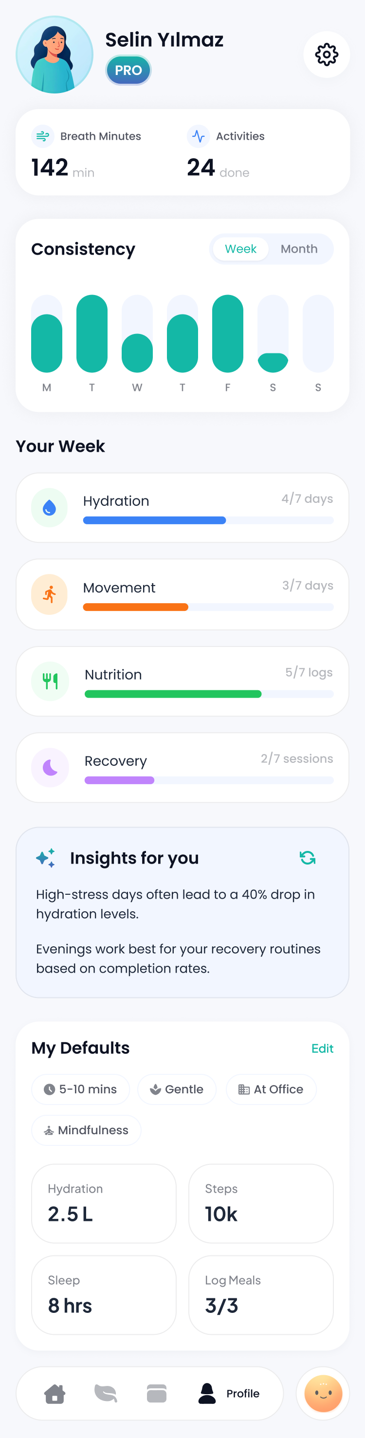
The profile is where a wellness app shows what it thinks of its user: red bars for missed days, streak counters, empty cells. In Tend's profile:
- Consistency bars are soft green. A gap day is just a shorter bar.
- Your week shows the four pillars as fractions, like 4/7 or 3/7: a rhythm, not a score.
- Insights flag patterns the user might miss, like hydration dropping on high-stress days.
- My defaults keeps Selin's preset context (5 to 10 minutes, gentle, at the office), where every recommendation starts.
Scroll inside the screen.
Visual identity
Warm, but grown up
Wellness apps usually go pastel and rounded, which feels childish to a 30-year-old professional, or clinical, which feels like being monitored. I aimed between the two.
Two palettes, one action colour
Morning surface, terracotta, midnight, deep midnight, cream star and teal. Teal is the only action colour in both modes, so a button always looks like a button.
Type
Greetings and headings use an italic serif, like handwriting in a notebook. Everything functional, from chips to the tab bar, uses Inter.
A small system
I drew custom icons at a 1.5 px stroke, so every screen speaks with one voice. The component set covers four high-fidelity screens and takes new content without rework: reusable cards for pillars, featured items and fresh picks, one primary button with a voice alternative, mode-aware colour and elevation tokens, and a four-tab bar under the companion.
Process
How I used AI in two weeks
These tools are why this fit into two weeks: AI gave me more options, faster, and choosing between them was my job.
| Step | Tool | What the tool did | What I did |
|---|---|---|---|
| Research | ChatGPT, Gemini | Turned reading on decision fatigue, streak anxiety and Tiny Habits into draft principles in about three hours | Cut and rewrote them into the four rules |
| Persona | ChatGPT, Figma Make | Drafted Selin in one pass and visualised her | Tested each decision against her |
| Layout | Figma Make | Four wireframe-level directions for the home screen | Chose the two-mode home and drew the final UI in Figma |
| Companion | ChatGPT | Three rounds of the mascot character | Art direction and the final pick |
| Copy | Gemini | Eight versions of the companion's opening line | Chose "I'm here with you" |
| Illustration | Gemini, ChatGPT | Drafts of the small illustrations inside cards | Selection and consistency |
Next steps
What I'd test first
The voice input
Tune my day only works if "back-to-back meetings until 4" reliably changes the plan, so language-understanding tests come first.
Two modes against one
A controlled A/B test of the two-mode home against a static layout. I believe in the idea, but belief isn't evidence.
Streaks as an option
Some people like streaks. An opt-in mode could serve them and keep the default guilt-free.
Sharper chips
Tighter chip sets for Tune my day, grouped by context, energy, stress and time available.
The Plan tab
Build out the placeholder Plan tab once the home flow is validated.