Work / HiDoctor / Booking and payment
HiDoctor: improving the booking and payment experience
People came to HiDoctor ready to talk to someone, and too many left before paying. I redesigned the two places they left: payment first, then choosing a psychologist. After both went live, paid sessions rose about 50%.
Payment live in October 2022, the booking steps after it. Desktop and mobile web.
- Role
- Product designer: research, UX, UI and handoff
- Product
- HiDoctor, online therapy and health consultations
- Timeline
- From summer 2022, in two releases
- Worked with
- Product, marketing, customer support, psychologists and developers
In short
- Problem
- People left while choosing a psychologist, and at payment after already picking a time.
- What I did
- Turned a cross-team journey map into 80 scored issues and fixed the flow backwards, with one rule: a line stays only if it answers a question people have at that moment.
- Result
- Paid sessions rose about 50% from before to after release. The first-session discount ran the whole time, so it doesn't explain the change.
Overview
Four steps, two places people left
- Step 1Choose a psychologist
- Step 2Choose the session
- Step 3Pay
- Step 4Join the call
I worked backwards: payment first, because the people leaving there had the strongest intent, then the choosing steps.
Research
From a journey map to 80 scored issues
I built a customer journey map from usability tests of the live product, a competitor review and a heuristic evaluation, with product, marketing, customer support and business in the sessions.
It followed Ece, 32, a business analyst in Istanbul who had just had her first panic attack, through seven stages from finding HiDoctor to booking her next session.
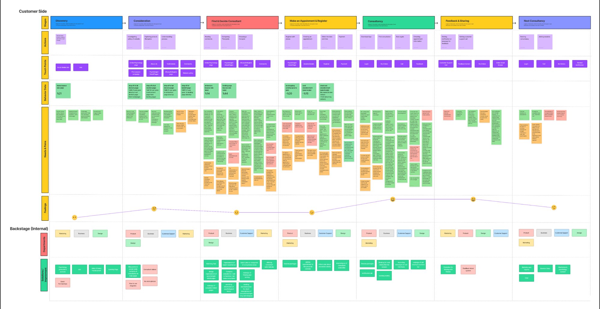
A map is easy to agree with and hard to act on. So I turned every pain into a row: 80 issues across 13 parts of the product.
Each one was scored for UX, product, purchase and frequency. The team reviewed the list in August 2022 and gave every row an owner.
The rows this case answers
| # | What testers said | Step | Priority |
|---|---|---|---|
| 45 | "Typing the card number would be easier if it were split into four blocks." | Pay | 150 |
| 46 | "While I was accepting the terms of use, it also wanted to store my card in Masterpass. That bothered me." | Pay | 120 |
| 50 | "I should be able to switch between paying from my wallet and paying by card." | Pay | 120 |
| 49 | "When I pay, show me the psychologist, the date and time and how many minutes I'm buying." | Pay | 18 |
| 36 | "The about section was hard to read. Education mattered most to me, and it got lost." | Choose | 96 |
| 29 | "I clicked to make an appointment, then had to click again to see the calendar. One psychologist had no free times, and I only found out at the end." | Choose | 72 |
| 32 | "When the psychologists I picked were only free on later dates, my search just ended. I wish I could filter by who is free today or in the next few days." | Choose | 64 |
| 39 | "What is the difference between 30 and 45 minutes? How do I choose?" | Choose | 27 |
The top of the list, a matching feature and rebooking after a session, were projects of their own. Payment was the most contained start: its top three rows scored 4 or 5 on purchase, all on one page that was losing people who had already chosen a time.
Phase 1
Payment
The last step, where the most motivated people were leaving.
Phase 1 · Problem
People reached the last step and stopped
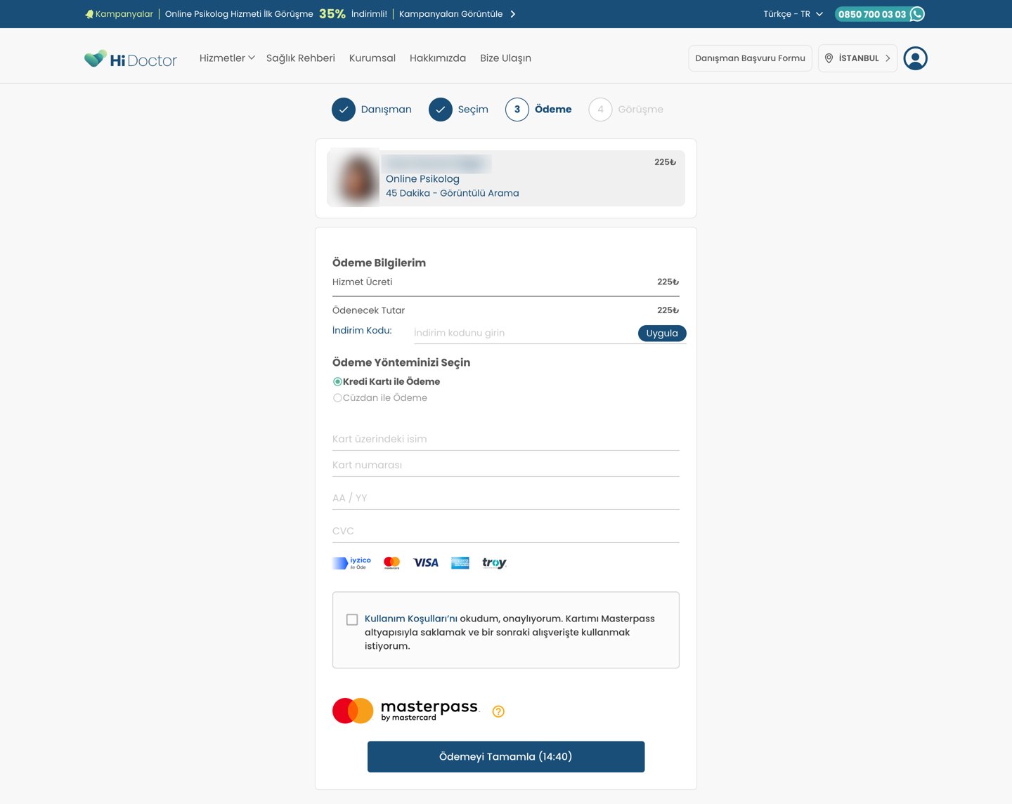
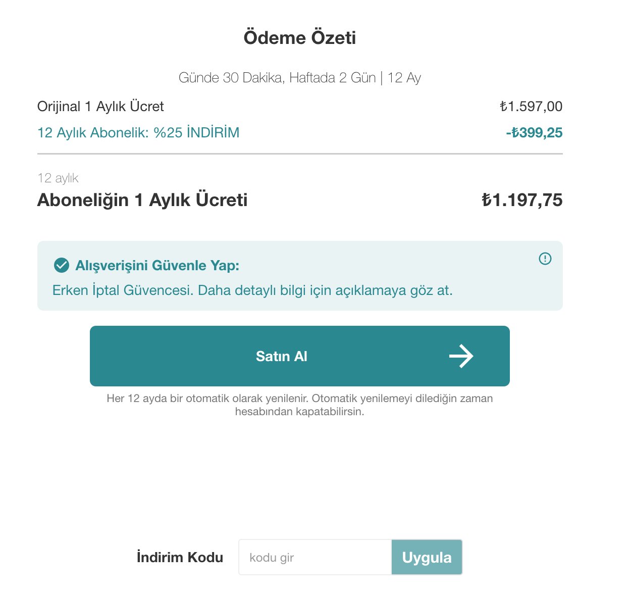
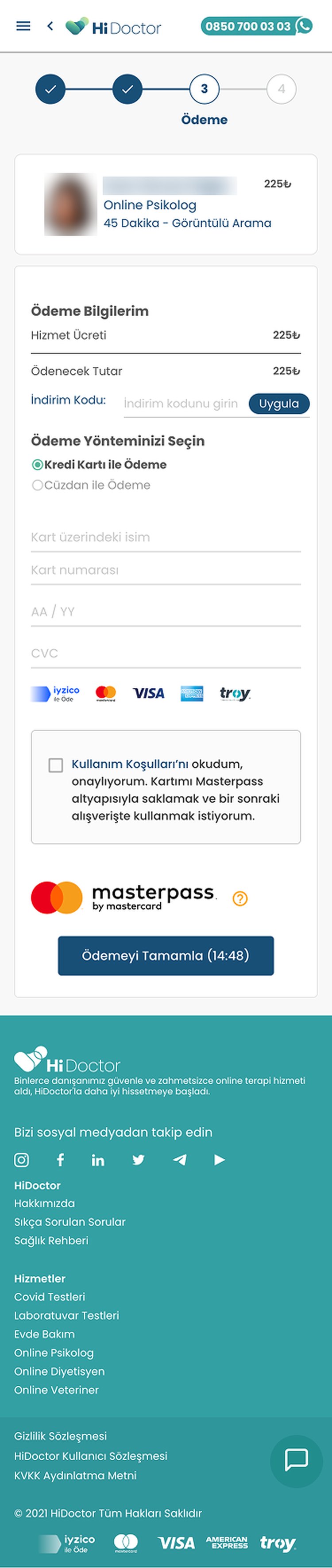
Picking a time held the slot for 15 minutes, then the booking was lost. In June and July 2022 data, checkout abandonment was climbing among returning visitors, people who came back with a psychologist already in mind.
The page failed in three ways, the same three I use for the rest of this case.
Trust missing answers Attention things competing with the button Effort work the form asked for
- Trust · missing answerNo date or time. The card showed who and how long, not when. The banner's discount wasn't in the price either.
- Attention · extra noiseAn open discount field near the top. It sent people without a code looking for one.
- Effort · extra workFields without labels. Placeholders vanished on typing, and the card number was one long string.
- Attention · extra noiseA boxed paragraph of consent. Accepting the terms also saved the card to Masterpass, in three lines of small print.
- Attention · extra noiseA loud Masterpass logo. The brightest colour on the page sat next to the button, not on it.
- Attention · extra noiseThe button out of sight. It started 1,055 px down, below the first screen on most laptops.
Phase 1 · Design
One rule for every line on the page
The CEO wanted more colour and longer explanations to reassure people. I agreed on reassurance, not on more text: at the moment of paying, every extra line adds load and takes away trust. That disagreement became the rule.
A line stays on the page only if it answers a question people have at that moment. Everything else is folded away, shortened or removed.
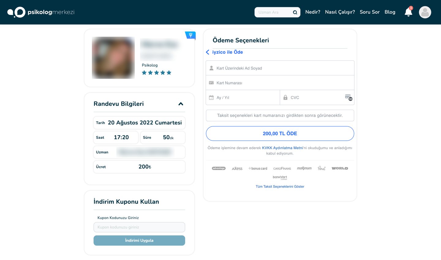
Two competitor patterns answered the same doubts our testers had.
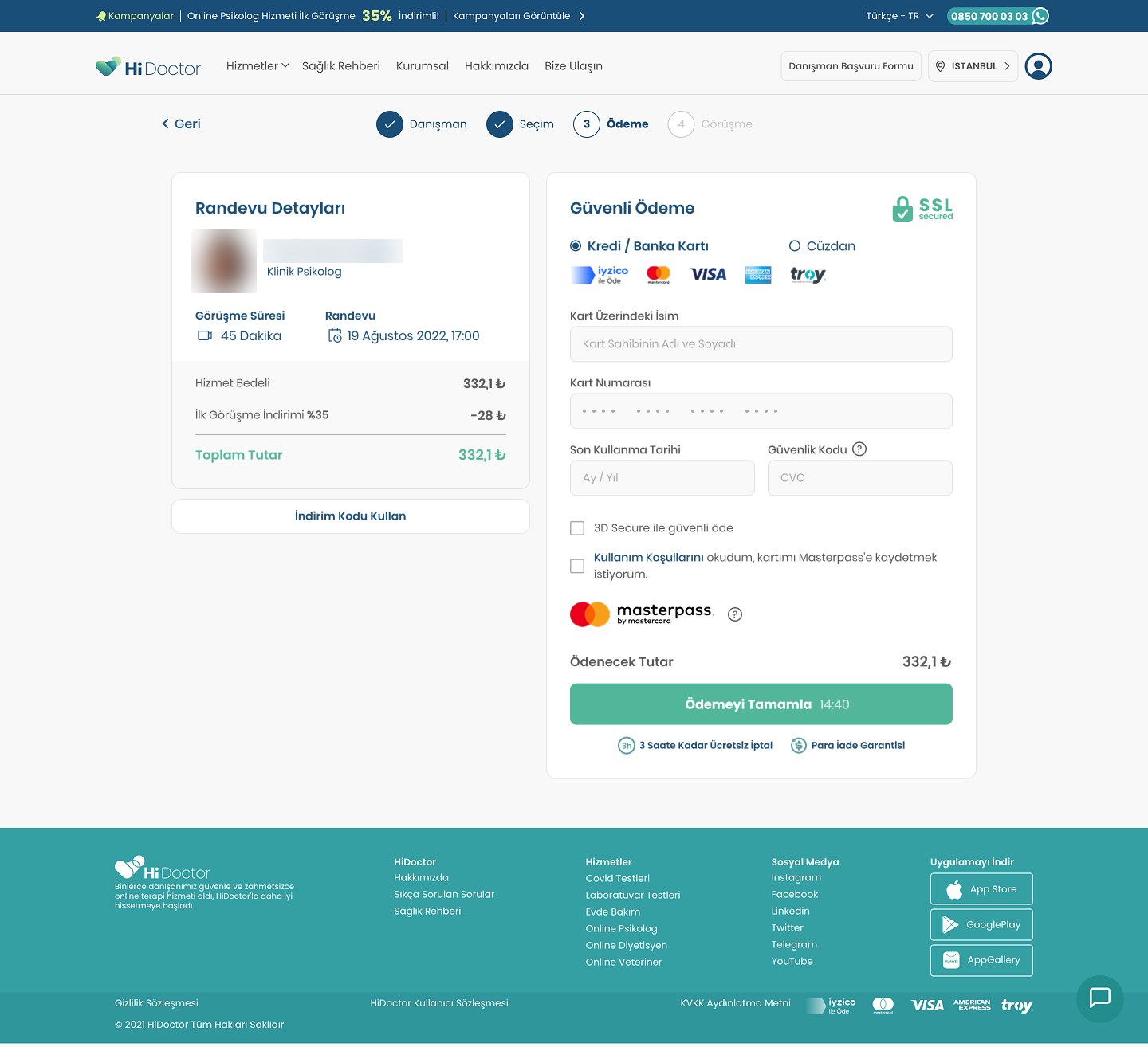
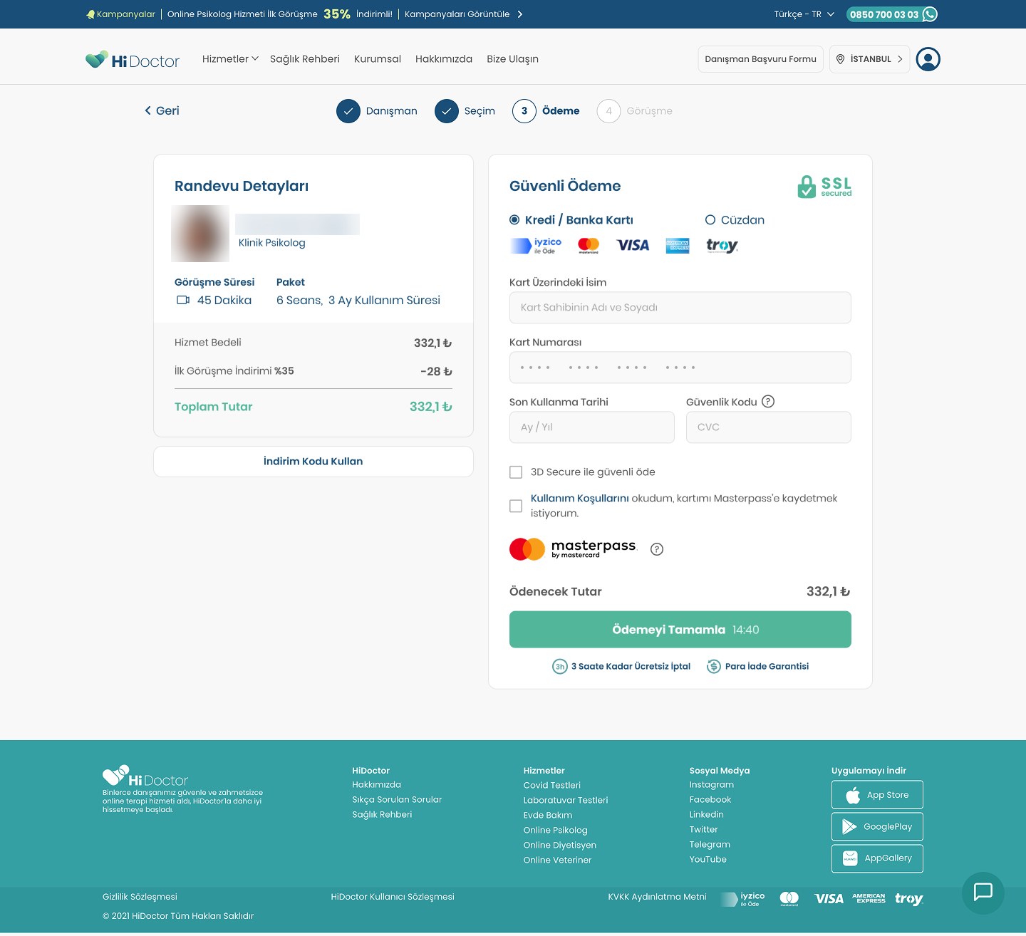
On our page, the rule added missing answers and removed what competed with the button. Tap a number to see each change.
- Trust · answer addedThe appointment, in full. Psychologist, title, session length, date and time. Issue 49
- Trust · answer addedThe discount, visible. Fee, 35% first-session discount and total, so the price matches the banner people clicked.
- Attention · noise removedThe discount code, folded. One "Use a discount code" button, which people with a code still find.
- Trust · answer added"Secure payment" and an SSL badge. The title names the step before anyone types.
- Effort · work removedCard or wallet, side by side. Paying by card works even with a balance in the wallet. Issue 50
- Effort · work removedFields people can type into. Labels above every field and the card number in four blocks. Issue 45
- Attention · noise removedConsent in one line. Masterpass required one checkbox for both, so I kept it, cut the text to one sentence and made the logo quieter. Issue 46
- Trust · answer addedThe total, right above the button. The timer moved inside the button.
- Trust · answer added"If I'm not satisfied, what do I do?" A journey map question, answered under the button: free cancellation up to three hours before, and a money-back guarantee.
Phase 1 · Mobile
Where the rule cost length
With no second column on a phone, the new answers stretched the page from 1,768 px to 2,101 px. Cutting them would have brought the doubts back, so I solved the length instead.
A fixed bottom bar keeps the total and the button on screen from the start, however far people read.

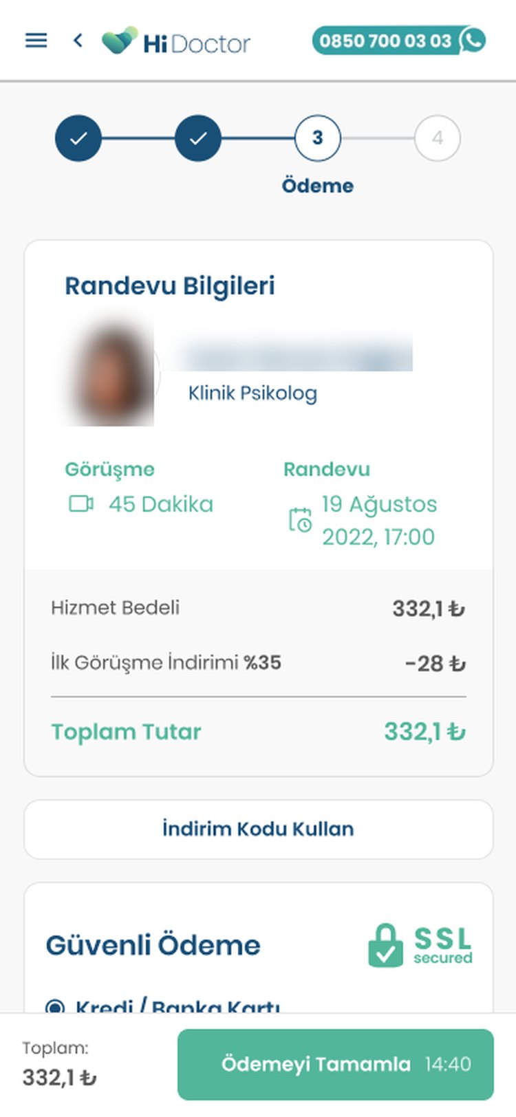
The same layout worked for packages: the card shows the number of sessions and their validity instead of a date.
Phase 2
Choosing and booking
The steps before payment, for the people who never got that far.
Phase 2 · Problem
Two booking buttons almost nobody looked at
The journey map showed that about 35% of people who opened the psychologist list from the home page left from there.
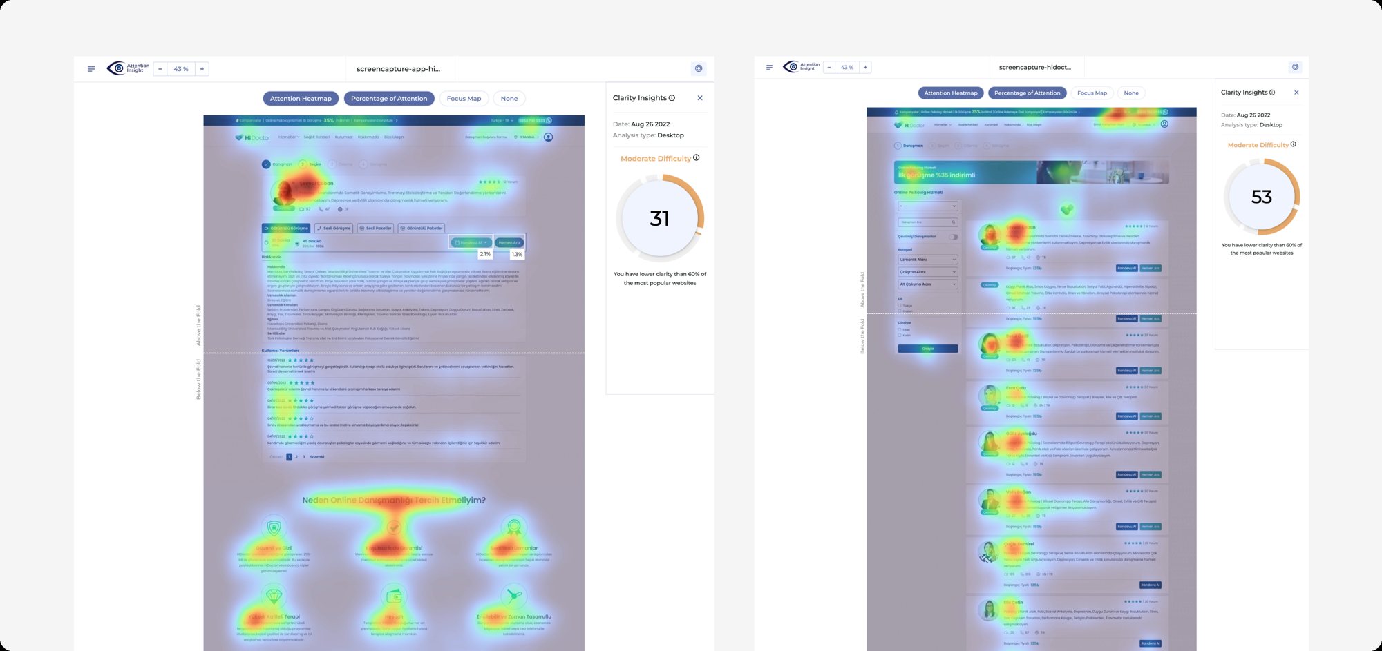
In August 2022 I ran an attention analysis on a profile and the list. The profile's two booking buttons drew 2.1% and 1.3% of attention, the photo and long text most of the rest.
The profile had the same three kinds of problems as payment.
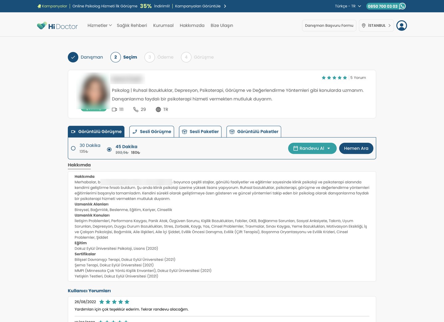
- Attention · extra noiseA summary no one could compare. Each psychologist wrote it differently: topics, schools or a sentence about themselves.
- Trust · missing answerNumbers without words. A camera, a phone and "TR", each with a number, left people guessing what was counted.
- Attention · extra noiseFour tabs for two questions. Video or phone, single session or package, all mixed in one row.
- Trust · missing answer30 or 45 minutes, with no reason to pick either. Issue 39
- Effort · extra workFree times behind another click. "Make an appointment" opened a menu, so people only learned a psychologist was fully booked at the end. Issue 29
- Attention · extra noiseOne block of text. Topics in a long comma list, and education, the thing people looked for most, buried at the bottom. Issue 36
Phase 2 · Research
What other platforms and our psychologists told us
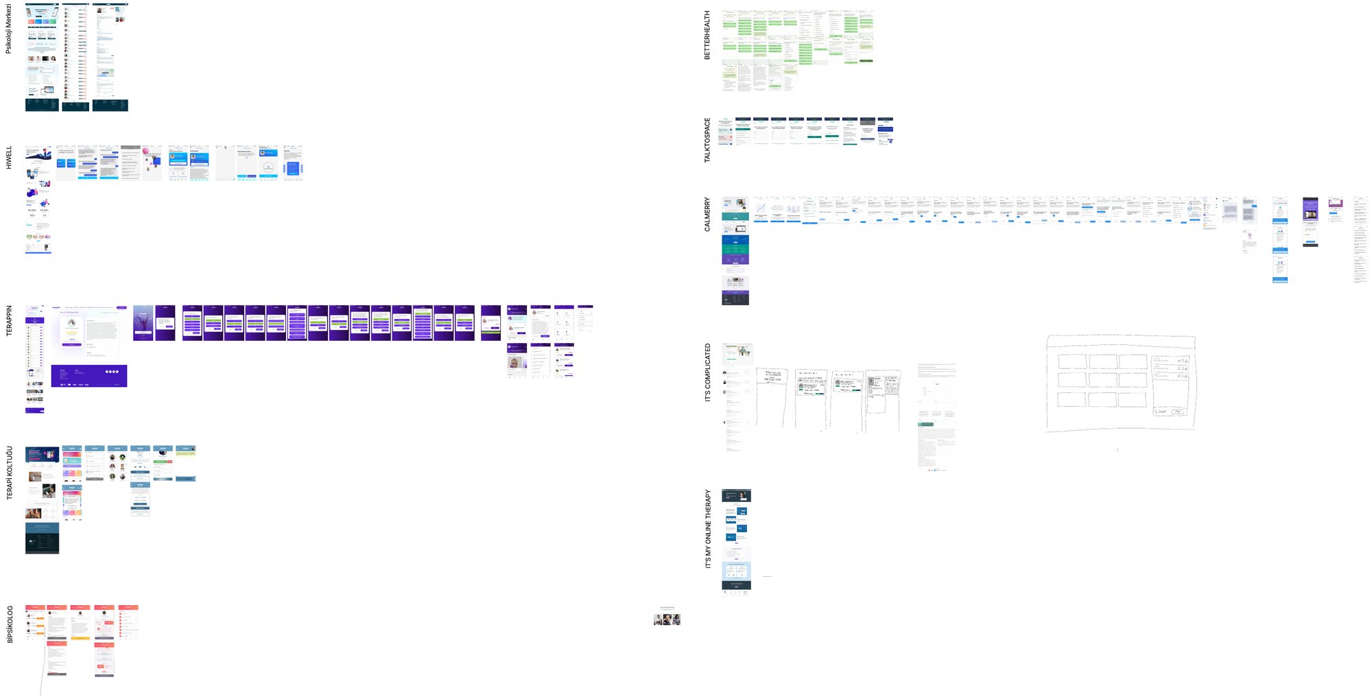
I compared the booking flows of ten online therapy platforms, from Psikoloji Merkezi, Hiwell and Terappin to Talkspace and BetterHealth. Three patterns kept coming back: a short matching test before the list, packages sold as their own product, and psychologists writing for the blog.
I sketched the flow on paper first: a topic choice, a list where each card answers the basic questions, a profile with booking beside it, and packages as their own choice.
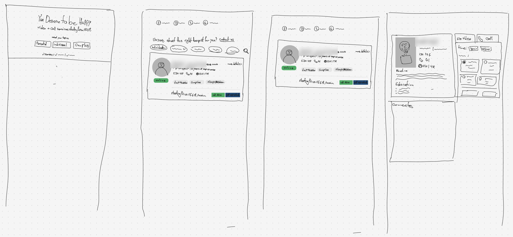
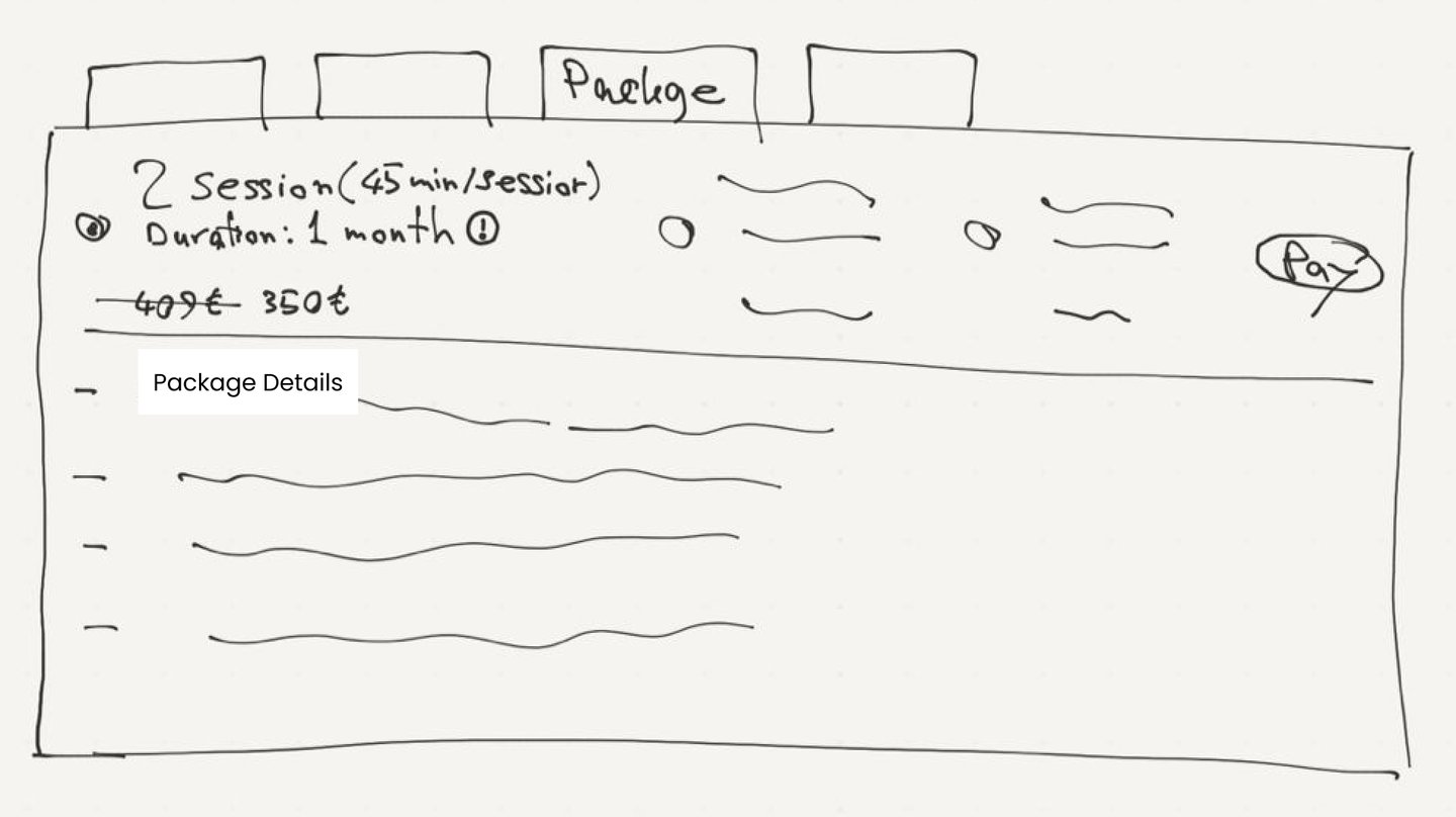
Then I showed them to psychologists on the platform. Their feedback changed more than the visuals.
- "You deserve to be happy" was the wrong promise. Therapy isn't sold on happiness. The headline became "You've already taken the first step towards feeling better."
- 30 or 45 minutes wasn't a real choice for clients. Both stayed, but 45 minutes became the preselected option. Issue 39
- Public reviews were sensitive. They stayed, in their own tab next to About, so a profile opens with who the psychologist is.
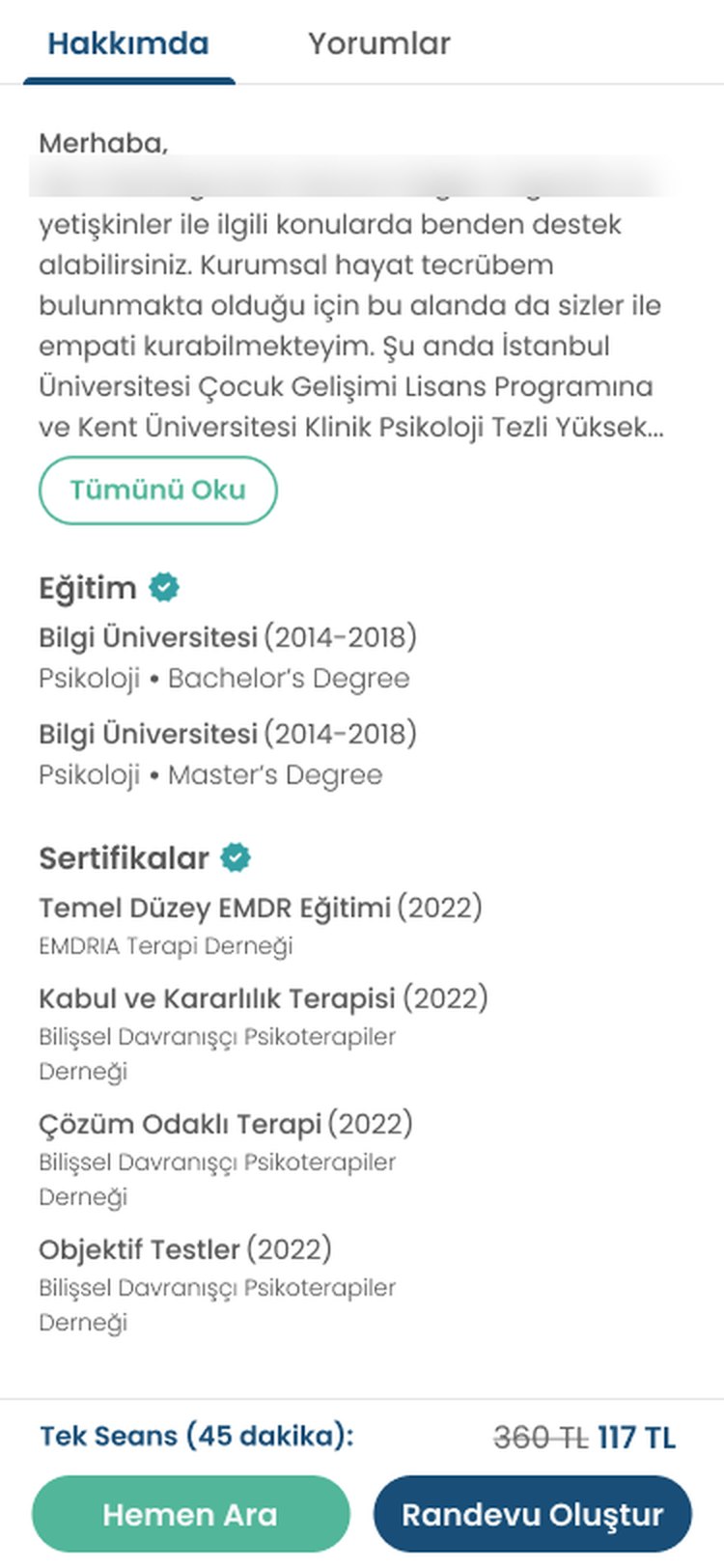
- Certificates needed context. Each one now shows the institution and the year, under a verified badge.
Phase 2 · Design
The same rule, earlier in the flow
Each screen answers the questions people have at that step, and nothing else. When choosing a psychologist, those questions are simple: who is this, what do they help with, what does it cost, when are they free?
Colours match the problems above. Tap a number to see each change.
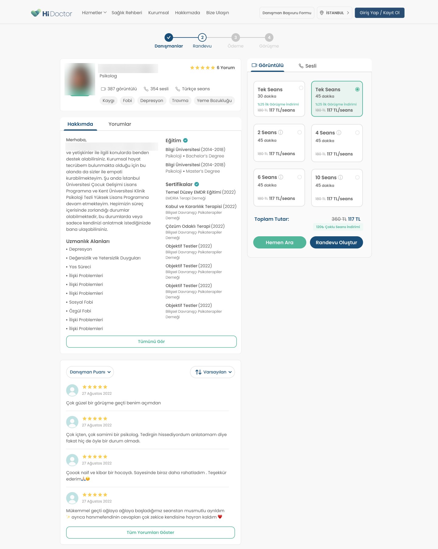
- Attention · noise removedThe same structure for everyone. About, specialties, education and certificates in fixed blocks, so two profiles can be compared. Issues 16, 36
- Trust · answer addedNumbers with words. "387 video, 354 phone, Turkish sessions" instead of three icons and three numbers.
- Attention · noise removedTwo tabs, not four. Video or phone on top. Single sessions and packages of 2, 4, 6 and 10 sit below as cards.
- Trust · answer added45 minutes preselected. The first-session discount is on the card itself. Issue 39
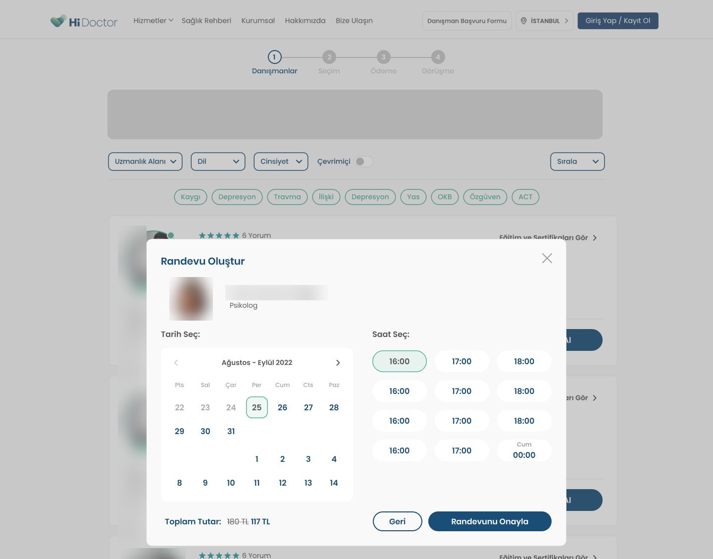
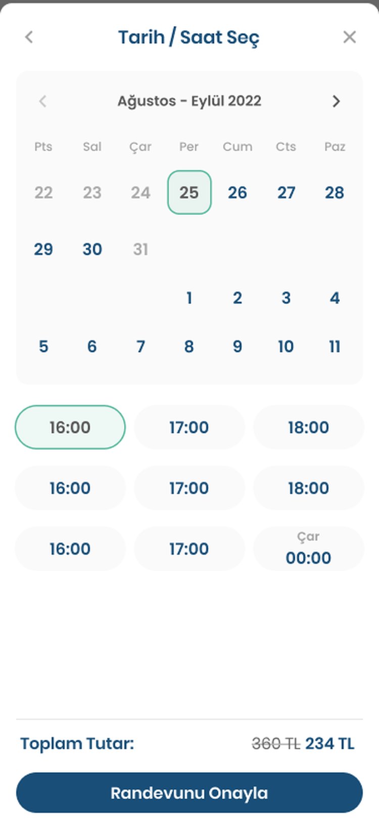
- Effort · work removedBooking opens on a calendar. "Randevu Oluştur" goes straight to dates and free times. Issue 29
- Trust · answer addedEducation people can check. School, degree, years and certificates, each block marked as verified. Issue 36
- Trust · answer addedThe total, with the saving. Old and new price and the multi-session discount, right above the buttons.
The list does more of the work
Most people never needed the profile to decide, so the list started answering "when are they free?" before anyone clicks.
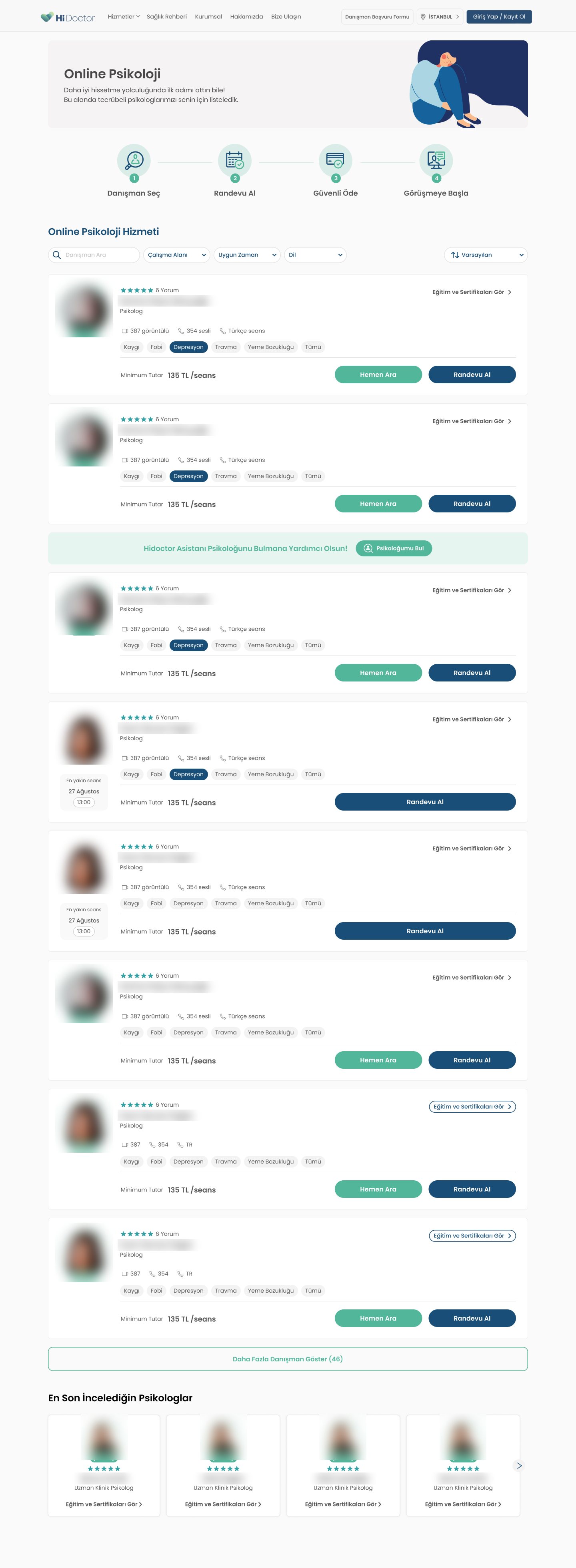
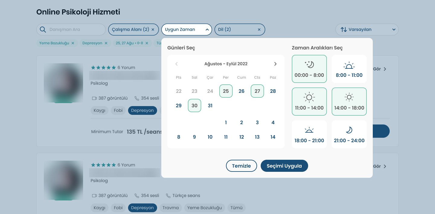
On a phone the long profile borrowed the payment page's fix: a fixed bar with the total and both buttons, plus a full-screen calendar for picking a time.

Outcome
More paid sessions, from both ends of the flow
There was no A/B test, so I can't split the result between the two phases. The 35% first-session discount ran the whole time, so it doesn't explain the change.
Both parts kept evolving for three more years. These are the first versions, the ones that moved the number.
Looking back
What I'd do differently
- Measure each step on its own. One before-and-after number convinced the team, but it can't say which phase did more. Step-by-step tracking from day one would have.
- Design payment and confirmation together. A countdown on the success screen made people panic, and there was no way to add the session to a calendar. Both scored low, so they waited. For the client, paying and getting ready are one moment.
- Question the timer. I kept the 15-minute countdown on the button. Today I'd test showing it only in the last few minutes.